Sankey diagram basics
H. Riall Sankey gave his name to the Sankey diagram. The Sankey is a specific type of flow diagram, in which the width of the arrows is displayed proportionally to the flow quantity. These diagrams are typically used to visualize factors such as energy transfer, material flow, or monetary transitions within a system. The conservation of energy and mass is assumed. At intersections, the sums of the incoming and outgoing quantities are equal.
A waterfall may be used as a comparison. No matter how often the watercourse branches out, almost all the water fed in reaches the pool.

The Alluvial diagram is a newer type of chart. It uses the same logic to show how the identical dataset regroups according to different dimensions.
The idea behind a visualization of this type is the following: Extensive data and correlations are put into a visually intuitive form in order to gain a common understanding of an issue. Using data visualization and material flow planning software, it is quite easy to create Sankey charts nowadays.
No matter whether it is a bar chart or a Sankey diagram, most of the effort goes into obtaining the data.
Applications and benefits for layout planning
The Sankey diagram is a typical result of a material flow analysis of the current state. Common data sources are ERP software or transport control systems in the real world.
Sources and sinks – called nodes – are graphically connected with arrows in the diagram. In the layout, production equipment is connected via transports according to the process sequence. The connection width corresponds to the flow intensity, which can be measured in different ways.
An abstract approach can be realized via volume or mass flow. These figures are measured in m³ or tonnes per year and are independent of the means of transport. A more practical measure is the number of transports per reference period. However, this approach depends on the means of transport, which may not yet have been determined.
Connecting such transport data with layout geometry is referred to as transport effort. The following video explains the term.
Now, let’s create some charts for different types of practical use cases in factory layout planning.
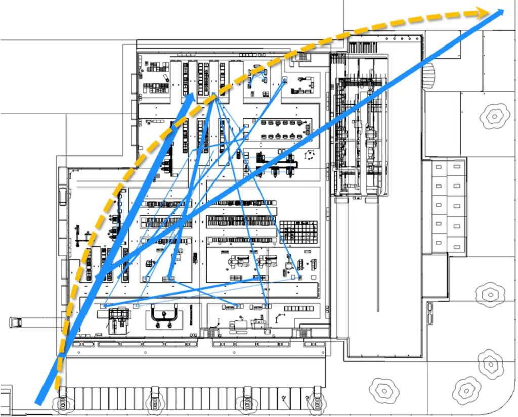
Layout-bound material flow diagram
Production facilities act as nodes. Direct transport connections between them create a general idea of how the material flow is oriented (yellow) in the overall process.
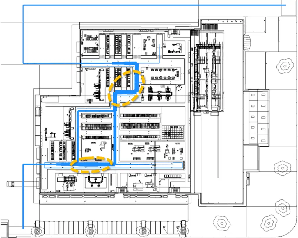
Transport route-bound material flow diagram
Connections run to and along transport routes. They give you a more precise result for:
- Length of transportation
- Freedom of intersection
- Straightness of material flow
These points are often used as criteria in a utility analysis for layout variants.
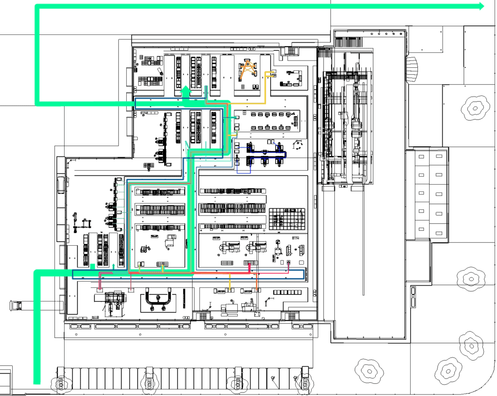
The chart also helps you to depict paths of product types through production scenarios.
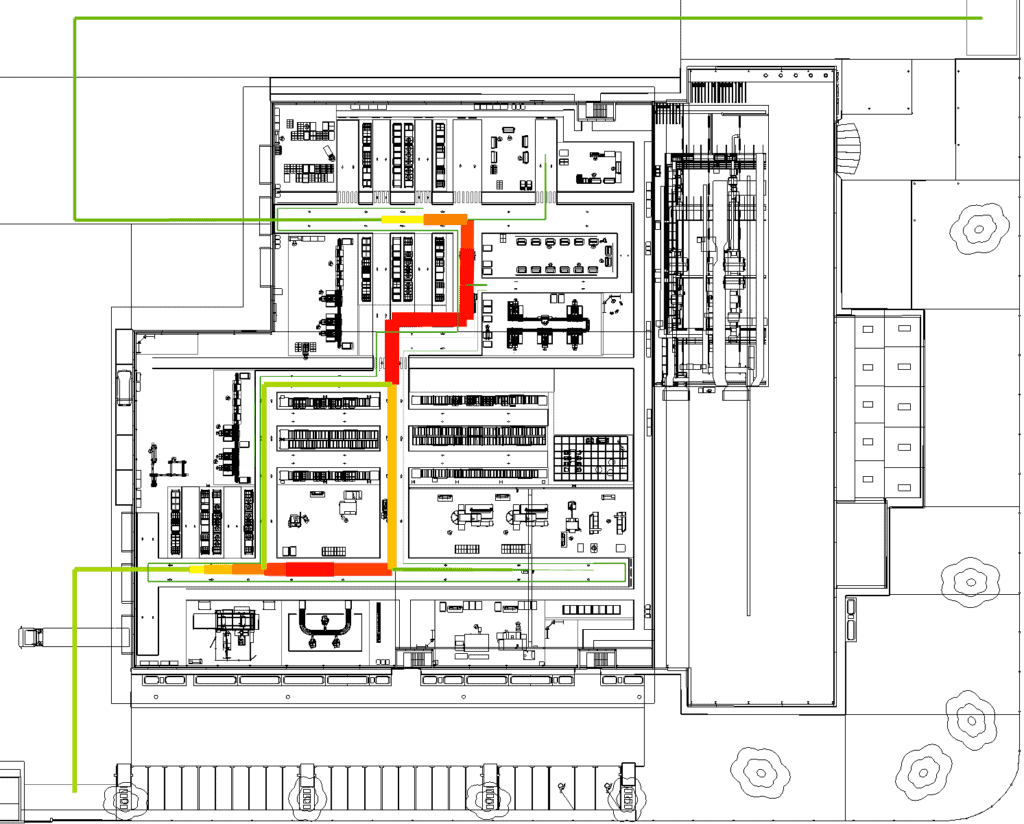
Transport route-bound Sankey diagram
Connections on the same route segment are aggregated. This Sankey chart, in the truest sense of the word, helps you to locate the maximum material flow in your layout (yellow). This knowledge could be the subject of subsequent CIP workshops on your planning concept.
Sankey diagram with load utilization
Transport route segments are mapped in classifications from:
- High transport frequency (red)
- To medium frequency (yellow)
- To low frequency (green)
Use this Sankey representation in order to find the busiest transportation route segments. This can serve as a starting point for a risk analysis.
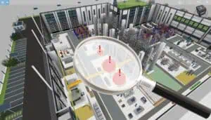
Material flow in three dimensions
Previous arrows now become throw parabolas, which end steeply at the flow sink.
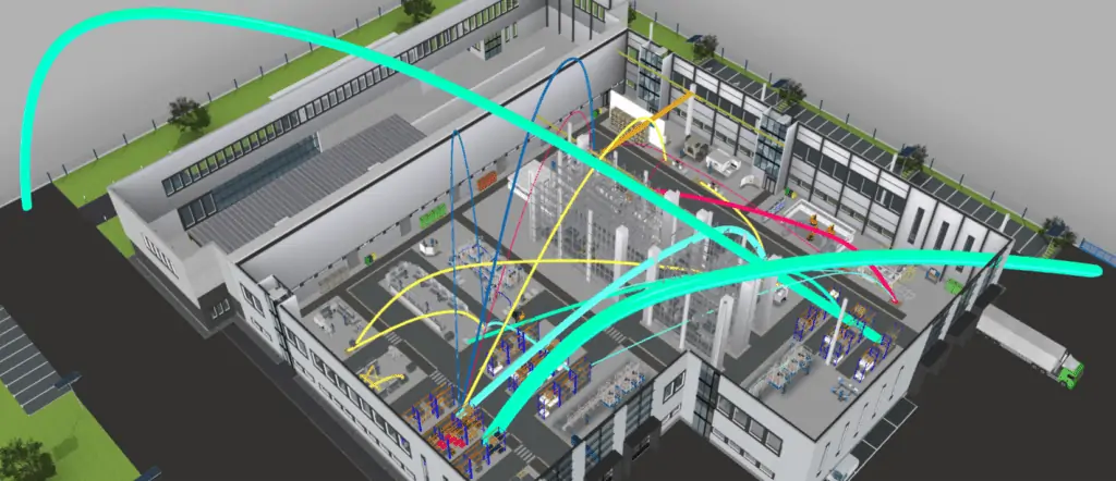
Stakeholders might not be able to interpret 2D plans so well. This 3D visualization helps to convince them of your current planning project results. Just give it a try at your next project presentation!
Conclusion
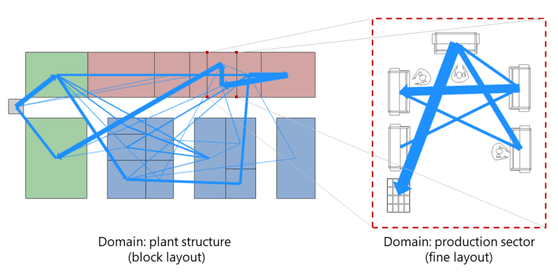
No matter what level of detail you are working at during factory planning – Sankey diagrams provide visual guidance for flow visualisation and subsequent material flow planning. A final example is shown in the Sankey below, starting with the block layout on the left. For a more in-depth look at the part on the right, we invite you to read the article on the spaghetti diagram.
If you don’t want to miss any articles on factory design, layout planning, and material flow, subscribe to our blog! We will keep you up to date.